


Eight years of first renewal! TRON launches new logo, opening a new chapter in Web 3.0
 On September 23, TRON founder Justin Sun announced on the X platform that TRON has completed a comprehensive brand upgrade and released a new brand visual and logo. This is the first major brand upgrade for TRON since its establishment in 2017, coinciding with its eighth anniversary, aimed at conveying the new strategic proposition of "breaking boundaries and integrating coexistence."
On September 23, TRON founder Justin Sun announced on the X platform that TRON has completed a brand new upgrade, with a new logo unveiled simultaneously. This is the first major visual upgrade of the TRON brand since its establishment in 2017. Coinciding with the important milestone of TRON's eighth anniversary, the new logo is not only a visual evolution but also a strategic declaration of TRON's new journey.
The new logo conveys TRON's value proposition of "breaking boundaries and integrating symbiosis" through a visual language that is more powerful, trustworthy, and recognizable. It also symbolizes TRON's commitment to embracing global cooperation and innovation with a more open attitude, co-building a "metaverse financial free port."

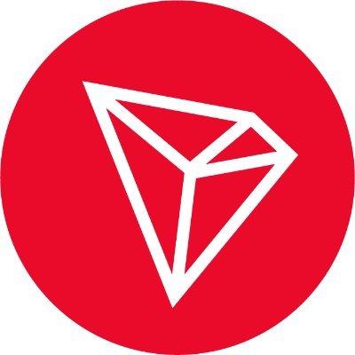
From Equilateral Triangle to Diamond Polyhedron: The Design Philosophy of 8° Rotation
The new TRON logo injects a brand new design concept based on the original "diamond icon + TRON text mark":
l Icon: Based on the original diamond-shaped polyhedron, it has been reconstructed using the golden ratio to enhance the stability and order of the diamond polyhedron. The design starts from an equilateral triangle, drawing perpendicular lines from each vertex to the opposite side, selecting the golden ratio point between the perpendicular point and the vertex, and then drawing a parallel line through the golden ratio point to connect two new vertices, resulting in a precisely constructed diamond polyhedron. In the final presentation, the diamond polyhedron icon is rotated 8° clockwise, which not only achieves the best visual balance and comfort but also resonates with the historical moment of TRON's eighth anniversary. Additionally, in the Chinese context, "8" symbolizes "prosperity," adding cultural significance and growth meaning to the icon.

l Text Mark: The design of the TRON text mark also has its intricacies. To ensure the breathing sense and structural balance of the logo, the character spacing and shapes were readjusted, maximizing the potential of the originally sans-serif characters. Particularly, the dot design in the "O" not only carries a sense of stability but also cleverly balances the visual weight of each letter, making the logo overall more breathable.
Overall, whether in the icon or the text mark, the lines have been moderately thickened to enhance the brand's sense of power and trustworthiness. In the complex and ever-changing environment of Web 3.0, trust is particularly precious. As a leading public chain globally, TRON is conveying this stability and reliability with a more substantial visual language.
In terms of color, TRON continues to use red as its core brand color and has added a dedicated red shade, Pantone 185C, to meet diverse communication needs. The auxiliary color significantly increases the proportion of white, replacing the original heavy black and red combination, making the overall image lighter and more futuristic.
Looking at the logo renewals of top brands, they often carry a tribute to history and a guide to the future. Xiaomi integrates the philosophy of "technology and life compatibility" through the transformation of shapes, while Walmart continues its promise of warmth and trust with soft lines and deep colors. TRON's logo renewal, with precise geometric reconstruction and restrained visual emphasis, signifies its firm determination to step into a new era of digital finance.
Beyond Visuals: The Value Core Behind the Logo Upgrade
The logo's transition from slender to robust is also a reflection of TRON's growth from an industry explorer to a leader over the past eight years.
This logo upgrade is not merely a visual refresh but an intuitive manifestation of TRON's strategic development. With rapid business expansion and increased global influence, a unified and distinctive brand image has become an important support for advancing globalization.
Over the past eight years, TRON has developed into one of the top three public chains globally, with the total number of global accounts exceeding 330 million, daily active users surpassing 2.92 million, and total locked value (TVL) exceeding $28 billion. Looking to the future, TRON is committed to breaking down traditional financial barriers, allowing 8 billion people worldwide to participate equally and freely in value exchange and asset creation.
The new logo is a visual representation of this strategic vision; it not only enhances the brand's sense of power, trustworthiness, and recognition but also symbolizes TRON's transition to a more open and globally influential new stage.
A New Beginning: Leading Financial Freedom for 8 Billion People Globally
Bold, parallel, and lightly rotated 8°, the new TRON logo achieves a balance of inheritance and innovation, representing an advancement in visual language and a solemn commitment to the future. On the occasion of its eighth anniversary, the renewal of TRON's brand identity is both a tribute to past achievements and a declaration of future journeys.
The new logo is not only an update of the brand image but also a concrete expression of TRON's philosophy: to create a new era of financial freedom based on technology, bonded by trust, and with an open attitude, benefiting 8 billion people globally.
After eight years of hard work, the stars shine bright; a new chapter has begun, and the future is vast. TRON is moving forward with a new posture, embracing the journey ahead.
 Risk warning Risk warning